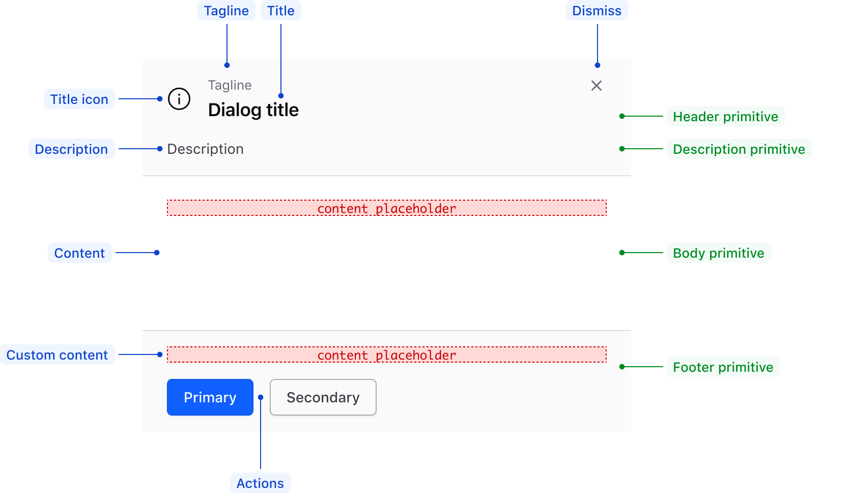
The DialogPrimitive contains the building blocks used to construct dialog-based components and consists of:
DialogPrimitive::Wrapperis the structure that contains and arranges all other dialog primitives.DialogPrimitive::Headercontains the title, dismiss button, and optionally a visually supportive icon and tagline.DialogPrimitive::Descriptioncontains optional descriptive information about the dialog.DialogPrimitive::Bodyis a generic container that houses the main content or message of the dialog.DialogPrimitive::Footercontains buttons to act on the content in the body container or link to additional resources.
Usage
The DialogPrimitive sub-components are not intended to be used independently of each other or in isolation. If you are looking to create your own dialog-based component, use the DialogPrimitive::Wrapper as your foundation.
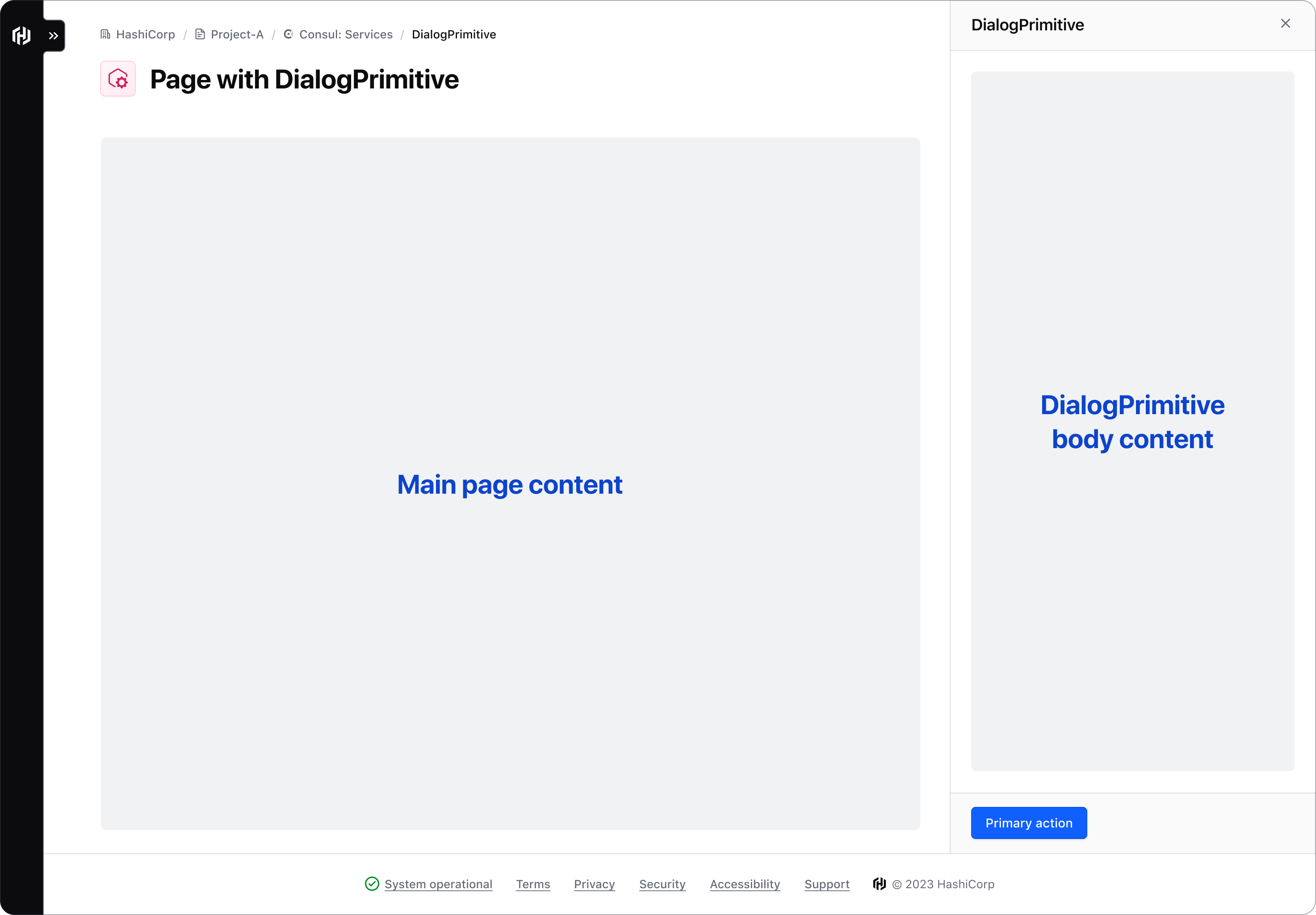
A common example of this is a non-modal dialog such as a SplitWindow or Panel, which allows the user to interact with both the main page content and the content within the dialog.

Use within HDS components
Examples of how to use the DialogPrimitive components can be found in the HDS Modal and Flyout components which are composed using the DialogPrimitive. They are both types of dialogs, but have different use cases depending on the context and type of information they convey.
What is a “dialog”
The term “dialog” has somewhat of a loaded meaning and, depending on the context, can be either an ambiguous high-level term or have a specific semantic meaning. For example:
- Broadly, the term dialog can refer to the interaction between a user and an application or machine that encourages a bidirectional exchange of information between the two.
- Specifically, a dialog can refer to a semantic
<dialog>element in HTML. This element can be further broken down into modal and non-modal dialogs, more details of which can be found in the MDN documentation.
The DialogPrimitive Wrapper is built on the HTML <dialog> element, and therefore supports the same JavaScript API.
How to use this component
The DialogPrimitive serves as the foundation for dialog derived components like the Modal and Flyout. Unlike other HDS primitives, we recommended using DialogPrimitive components directly when you need to create a dialog with a custom layout. This is particularly useful for constructing non-modal dialogs that integrate into a page layout, rather than floating above it.
Basic dialog using DialogPrimitive components
<Hds::DialogPrimitive::Wrapper>
  <:header>
    <Hds::DialogPrimitive::Header
      @icon="info"
      @tagline="Tagline"
    >
      Title
    </Hds::DialogPrimitive::Header>
    <Hds::DialogPrimitive::Description>Description</Hds::DialogPrimitive::Description>
  </:header>
  <:body>
    <Hds::DialogPrimitive::Body>
      <p class="hds-typography-body-300 hds-foreground-primary">Lorem ipsum dolor sit amet consectetur
        adipisicing elit. Libero culpa expedita assumenda at nisi minus unde fuga iure suscipit aut qui, odit
        natus eum voluptates ut molestiae! Perferendis, impedit qui? Lorem ipsum dolor sit amet?</p>
    </Hds::DialogPrimitive::Body>
  </:body>
  <:footer>
    <Hds::DialogPrimitive::Footer>
      <Hds::ButtonSet>
        <Hds::Button type="submit" @text="Primary" />
        <Hds::Button type="button" @text="Secondary" @color="secondary" />
      </Hds::ButtonSet>
    </Hds::DialogPrimitive::Footer>
  </:footer>
</Hds::DialogPrimitive::Wrapper>
Header titleTag
The @titleTag argument changes the HTML element that wraps the DialogPrimitive::Header tagline and "title" content. When organizing the content on a webpage, the heading levels should reflect the structure of the page. For example, if the DialogPrimitive is used as a Split Window, the value should be "h2".
Page title
<div class="doc-dialog-primitive-grid-layout">
  <div class="doc-dialog-primitive-flex-layout">
    <Hds::Text::Display @tag="h1" @size="500">Page title</Hds::Text::Display>
    <Doc::Placeholder @text="Main content" @height="100%" @width="100%" @background="#eee" />
  </div>
  <Hds::DialogPrimitive::Wrapper class="doc-dialog-primitive-with-border">
    <:header>
      <Hds::DialogPrimitive::Header
        @icon="info"
        @tagline="Tagline"
        @titleTag="h2"
      >
        Split Window
      </Hds::DialogPrimitive::Header>
    </:header>
    <:body>
      <Hds::DialogPrimitive::Body>
       <Doc::Placeholder @text="Split Window content" @height="10rem" @width="100%" @background="#eee" />
      </Hds::DialogPrimitive::Body>
    </:body>
    <:footer>
      <Hds::DialogPrimitive::Footer>
        <Hds::ButtonSet>
          <Hds::Button type="submit" @text="Primary" />
          <Hds::Button type="button" @text="Secondary" @color="secondary" />
        </Hds::ButtonSet>
      </Hds::DialogPrimitive::Footer>
    </:footer>
  </Hds::DialogPrimitive::Wrapper>
</div>
Component API
A custom dialog can be implemented by composing the Wrapper, Header, Description, Body, Footer (and potentially Overlay) DialogPrimitive sub-components.
DialogPrimitive::Wrapper
This is the component used to provide the overall layout to the dialog.
<:header>
named block
DialogPrimitive::Header and DialogPrimitive::Description components should be added here.
<:body>
named block
DialogPrimitive::Body component should be added here.
<:footer>
named block
DialogPrimitive::Footer component should be added here.
…attributes
...attributes.
DialogPrimitive::Header
A sub-component used to provide the header content.
icon
string
tagline
string
yield
onDismiss
function
titleTag
enum
- div (default)
- h1
- h2
- h3
- h4
- h5
- h6
…attributes
...attributes.
DialogPrimitive::Description
A sub-component used to provide an extra description to the header.
yield
…attributes
...attributes.
DialogPrimitive::Body
A sub-component used to contain the main content of the dialog. When the yielded content exceeds the available space, a scrollbar is introduced to the container.
yield
…attributes
...attributes.
DialogPrimitive::Footer
A sub-component used to provide the footer’s content. We recommend using it exclusively for actions using the ButtonSet component. If a tertiary action is included, it will always be aligned at the end of the row.
yield
…attributes
...attributes.
The component also offers an onDismiss argument, yielded as F.close, but it’s only used internally in the Modal and Flyout components.
DialogPrimitive::Overlay
An overlay element that can be used to display a backdrop behind a modal dialog.
Consumers will need to take care of combining the DialogPrimitive::Overlay with the DialogPrimitive::Wrapper (with header, body, and footer content) by wrapping them in a parent container and implementing the desired layout.
Anatomy

| Element | Usage |
|---|---|
| Header primitive | |
| Title | Required |
| Title icon | Optional |
| Tagline | Optional |
| Dismiss button | Required |
| Description primitive | |
| Description | Optional |
| Body primitive | |
| Content | Required |
| Footer primitive | |
| Actions | Optional; maximum of three (primary, secondary, and tertiary) |
| Custom content | Optional |
Conformance rating
DialogPrimitive components are primarily containers which can be combined together to build a custom dialog and are not conformant on their own. Consumers are responsible for implementing the primitives in a way that results in a conformant experience for the user.
Applicable WCAG Success Criteria
This section is for reference only. This component intends to conform to the following WCAG Success Criteria:
-
1.1.1
Non-text Content (Level A):
All non-text content that is presented to the user has a text alternative that serves the equivalent purpose. -
1.3.1
Info and Relationships (Level A):
Information, structure, and relationships conveyed through presentation can be programmatically determined or are available in text. -
1.3.2
Meaningful Sequence (Level A):
When the sequence in which content is presented affects its meaning, a correct reading sequence can be programmatically determined. -
1.3.3
Sensory Characteristics (Level A):
Instructions provided for understanding and operating content do not rely solely on sensory characteristics of components such as shape, color, size, visual location, orientation, or sound. -
1.3.5
Identify Input Purpose (Level AA):
The purpose of each input field collecting information about the user can be programmatically determined when the input field serves a purpose identified in the Input Purposes for User Interface Components section; and the content is implemented using technologies with support for identifying the expected meaning for form input data. -
1.4.1
Use of Color (Level A):
Color is not used as the only visual means of conveying information, indicating an action, prompting a response, or distinguishing a visual element. -
1.4.10
Reflow (Level AA):
Content can be presented without loss of information or functionality, and without requiring scrolling in two dimensions. -
1.4.11
Non-text Contrast (Level AA):
The visual presentation of the following have a contrast ratio of at least 3:1 against adjacent color(s): user interface components; graphical objects. -
1.4.12
Text Spacing (Level AA):
No loss of content or functionality occurs by setting all of the following and by changing no other style property: line height set to 1.5; spacing following paragraphs set to at least 2x the font size; letter-spacing set at least 0.12x of the font size, word spacing set to at least 0.16 times the font size. -
1.4.13
Content on Hover or Focus (Level AA):
Where receiving and then removing pointer hover or keyboard focus triggers additional content to become visible and then hidden, the following are true: dismissible, hoverable, persistent (see link). -
1.4.3
Minimum Contrast (Level AA):
The visual presentation of text and images of text has a contrast ratio of at least 4.5:1 -
1.4.4
Resize Text (Level AA):
Except for captions and images of text, text can be resized without assistive technology up to 200 percent without loss of content or functionality. -
2.1.1
Keyboard (Level A):
All functionality of the content is operable through a keyboard interface. -
2.1.2
No Keyboard Trap (Level A):
If keyboard focus can be moved to a component of the page using a keyboard interface, then focus can be moved away from that component using only a keyboard interface. -
2.4.2
Page Titled (Level A):
Web pages have titles that describe topic or purpose. -
2.4.3
Focus Order (Level A):
If a Web page can be navigated sequentially and the navigation sequences affect meaning or operation, focusable components receive focus in an order that preserves meaning and operability. -
2.4.6
Headings and Labels (Level AA):
Headings and labels describe topic or purpose. -
2.4.7
Focus Visible (Level AA):
Any keyboard operable user interface has a mode of operation where the keyboard focus indicator is visible. -
3.2.1
On Focus (Level A):
When any user interface component receives focus, it does not initiate a change of context. -
3.2.2
On Input (Level A):
Changing the setting of any user interface component does not automatically cause a change of context unless the user has been advised of the behavior before using the component. -
3.3.1
Error Identification (Level A):
If an input error is automatically detected, the item that is in error is identified and the error is described to the user in text. -
3.3.2
Labels or Instructions (Level A):
Labels or instructions are provided when content requires user input. -
3.3.3
Error Suggestion (Level AA):
If an input error is automatically detected and suggestions for correction are known, then the suggestions are provided to the user, unless it would jeopardize the security or purpose of the content. -
3.3.4
Error Prevention (Legal, Financial, Data) (Level AA):
For Web pages that cause legal commitments or financial transactions for the user to occur, that modify or delete user-controllable data in data storage systems, or that submit user test responses, at least one of the following is true: submissions are reversible, data is checked and user is provided an opportunity to correct them, a mechanism is available for reviewing, confirming and correcting the information before finalizing the submission. -
4.1.2
Name, Role, Value (Level A):
For all user interface components, the name and role can be programmatically determined; states, properties, and values that can be set by the user can be programmatically set; and notification of changes to these items is available to user agents, including assistive technologies. -
4.1.3
Status Messages (Level AA):
In content implemented using markup languages, status messages can be programmatically determined through role or properties such that they can be presented to the user by assistive technologies without receiving focus.
Support
If any accessibility issues have been found within this component, let us know by submitting an issue.
4.11.1
Updated
Fixed issue with box-sizing inheritance due to a all: unset CSS rule
4.10.0
Updated
DialogPrimitive::Header
- Added the
@titleTagargument
4.7.0
Added
Added a set of utility "dialog" sub-components to act as primitives for Modal and Flyout (and to be used as standalone subcomponents if needed):
DialogPrimitive::WrapperDialogPrimitive::HeaderDialogPrimitive::DescriptionDialogPrimitive::BodyDialogPrimitive::Footer

